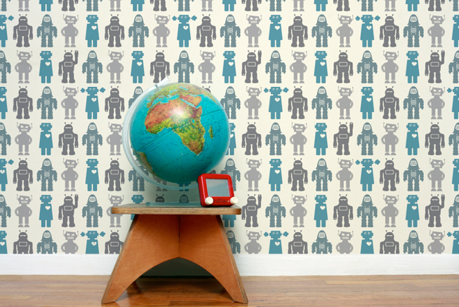
If I hadn’t decided to paint the baby’s room, I might have considered covering all four walls in a graphic wallpaper like Robots by Aimee Wilder. I am really drawn to the turquoise and grey combination of this kid-friendly pattern. One accent wall would have been a great option, too.
But I wonder how you would hang artwork or photographs on top of such a busy print. Wouldn’t it be too distracting?
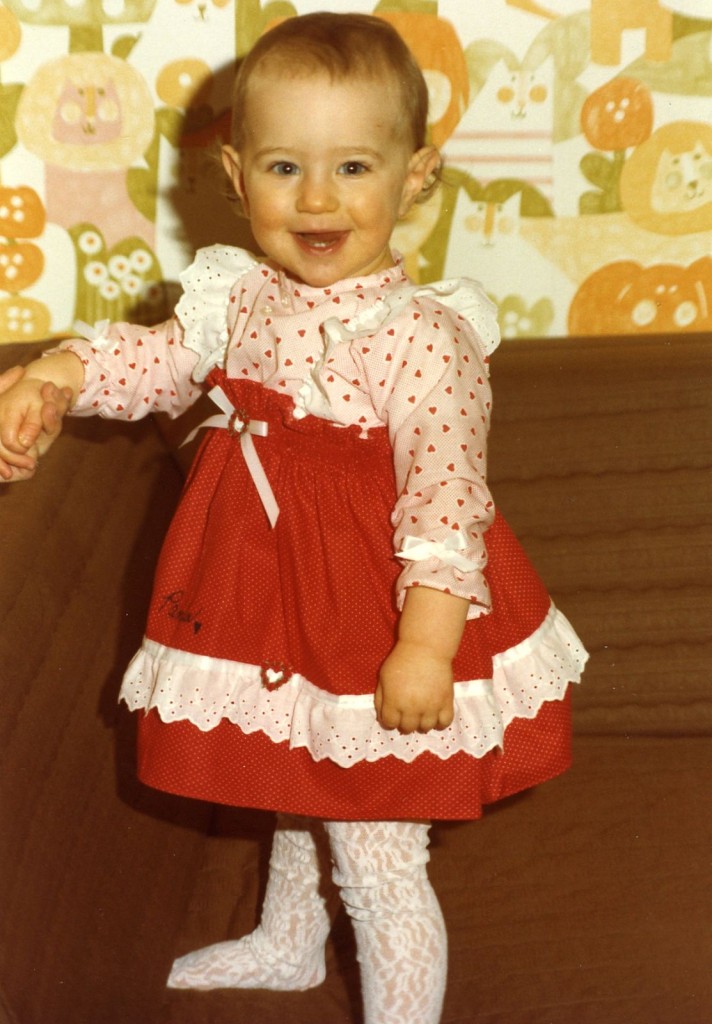
Speaking of busy prints, check out the retro jungle wallpaper in my own room from when I was a baby. The orange, golden yellow, olive green and white color palette is so late 70s/early 80s. Also check out my fancy lace tights. In that pink and red frilly dress, I’m all dolled up like a miniature country singer about to perform on Star Search.
Ah, the good ol’ 1980s…
{via Baby Mine}





Love it. As I recall we both had super busy prints, mine was lime green yellow and white, and I had matching EVERYTHING for it. Furniture, linens…etc etc etc. I think you;d be surprised how neutral it can be. It just blends after a while, I think art looks great over a busy print, especially if it’s large, with matting, and the art is simple itself. I know you’d make it work. I love your ideas so far!
Hey, Happy Mother’s Day.