When we left Omaha last September, my parents welcomed us back to my childhood home in New Jersey while we decided where to go next. By the time we moved out nine months later, I was itching to decorate with our furniture and home decor accessories.
The goal was to have our new townhouse put together by the end of the summer. Unfortunately, that didn’t happen. Between watching the kids and trying to squeeze the contents of a 2,200 sq ft house into a significantly smaller space (with significantly less storage), unpacking took longer than we had anticipated.
We also faced the challenge of decorating a rental. Since we can’t make any structural changes to the townhouse, we had to decide how much money we wanted to invest in less permanent changes. The verdict? Not much.
Plus, we signed a lease for only two years. Did we really need to revamp the entire townhouse, or could we live with some of the less-pretty features for that short amount of time? In the end, we decided our money and our time might be better spent elsewhere.
That’s not to say we haven’t made the effort to turn the townhouse into a townhome. Our Omaha home was decorated in a transitional style — traditional meets contemporary. But now I’m into chic California style, which I define as an easy mix of mid-century, contemporary, and bohemian decor.
Otherwise known as “Emily Henderson” style.
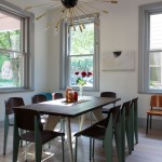
So one of the first updates we made was swapping the rustic light fixture in the dining room for a modern Sputnik chandelier from Lamps Plus. (See the before photo here!)
If you’re decorating a rental, the easiest way to change the look of a room (besides painting) is to replace the light fixtures.
Because you can see into the dining room from a cut-out window in the kitchen and because the dining room looks into the living room, the new mid-century modern chandelier totally changed the vibe of the entire first floor. Without a doubt, it’s my favorite piece in the room.
The table, chairs, and credenza all came from our dining room in Omaha. (We had to sell our China cabinet when we got here because it literally didn’t fit in the space.) I’d love a modern modern tulip table, and our West Elm chairs were badly damaged during the move, but replacing both is, sadly, not in the budget right now.
If the zebra stripe rug looks familiar, that’s because we bought it for Levi’s nursery (and big boy room). However, it clashed with the wall color in the boys’ shared room, so we moved it down here. It’s honestly not my favorite, but it serves its purpose. Plus, it was already stained, so we don’t have to freak out if somebody drops food on it.
The gold and black mirror is also not a favorite, but the wall desperately need something large. The giant mirror, which hung in our Omaha basement, reflects a ton of light and really opens up the space. It’s just a little bit too traditional looking though, so I’m thinking about spray painting it.
I also recognize that the dining room is a bit bare without art on the walls, but I’m having commitment issues with picking prints and deciding where to hang them.
What is your favorite feature in this room? And do you have any ideas what color I should paint that mirror? Or do you think I should swap it for oversize artwork instead?
Disclosure: This post is a collaboration with Lamps Plus. All ideas and opinions are my own! Thanks for supporting the brands that allow me to continue producing valuable, thoughtful, original content for this blog.


Love that light! And totally a fan of Emily Henderson and everything she does 🙂
Love it! I totally believe light fixtures are what make a room stand out. I’ll go thrifty on everything else and spend a good chunk of the budget on lights for that reason
I never really invested in light fixtures before, but after seeing what a difference this new chandelier made in the dining room, I’m now a believer on the power of a fabulous fixture!
Seriously. She can do no wrong. AND, she’s funny as hell.
I love the light that’s reflected from the mirror! And the vibe of the light fixture is very, very cool.
We’re in the same position of deciding how much to put into making our three-year rental home. Unfortunately (for our budget) most of our rooms came with bare bulbs hanging from 12-foot ceilings, except for the massive, gaudy sconces by our front door. We also have concrete walls that have no fixtures for hanging out mirrors, art and photos. It will be a miracle if we pull together any kind of a style before we move out! I think your place looks lovely.
Thanks, Lynn! Bare bulbs and concrete walls indeed sound like a decorating challenge. Can you paint? Are there other cool features about your rental home that you can highlight instead?
Wow! I love the light fixture you chose! It’s gorgeous! I’m in the same exact boat with our new rental home and it’s such a hard decision. I want to do so many things but can’t justify the cost like I could when lived in the home we own.
I feel ya. Even though we’re staying put in our rental for two years, it’s not “our” place. Whatever updates we make to the place (new light fixtures, etc), we hope to be able to take with us when we move.
I’m a sucker for a great light fixture, and this one really modernizes the whole room. Beautiful!
Thank you! I couldn’t believe what a big difference just changing the chandelier made to the entire look of the room.