Back when I wrote about my color inspiration for the baby’s room, I promised a post about furniture. Well, I’m finally following through!
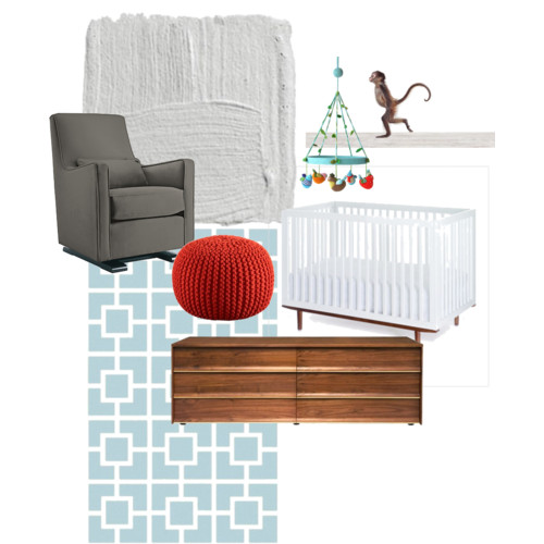
The idea of decorating excites me, but the actually process of furnishing and accessorizing a room can be overwhelming. Since I’m not a fan of matchy-matchy furniture sets, I can spend a great deal of time picking each individual piece. I find that inspiration boards, like the one I created above, help me better define my vision. I’m totally envious of designers who can thrown together a room on a whim!
JB and I knew we’d be repurposing a “vintage” wooden dresser in the baby’s room, so dark wood became the first element in my design. But I didn’t want the nursery to feel heavy with all dark furniture, so I looked for a white crib to add lightness to the space. Lucky for us, there weren’t that many affordable modern cribs, like the Ray from Muu, from which to choose, making our decision significantly easier.
As I’ve mentioned before, I don’t particularly care for traditional pastels for babies, so I began thinking about other possible color combinations to complement the wood and white pieces. I realized that most of the nurseries I admired used grey in their palettes, so I added the hue to mine! The final two shades, light blue and orange, then fell into place. I love bright, cheerful tangerine!
The nursery is on the small side, so we needed a glider that was tall and narrow rather than wide and plush. We also wanted it to be a modern piece that could work in other rooms down the line, so again, our options were limited. We debated between the Monte Luca glider and Jennifer Delonge’s original Luxe glider, and since neither reclined (and we didn’t want to pay for an expensive ottoman), we looked at CB2’s knitted pouf in blood orange to add a pop of color to the room.
When I started envisioning what our little guy’s room would look like, I didn’t give much thought to artwork and accent pieces, but I knew I wanted to include this whimsical bird mobile by blabla and possibly some baby animal photographs by Sharon Montrose. The monkeys are particularly adorable, don’t you think?
So there you have it! A room for a baby boy that I think is sophisticated yet playful. Yes, perhaps it’s more “mature” than a typical nursery, but that’s just my style — and I have to spend a lot of time in there, too!
PS: All we have in the baby’s room now is a dresser, crib and rug. Oh, and the walls are painted. We’re still waiting on a some big pieces and have four bare walls to fill! Of course, the finished nursery may not end up looking exactly like this inspiration board; I was using it as a guide to help me make decisions. I’ll be sure to post what our little guy’s room looks like as soon as it’s complete.


love it!! love the grey plus pops of color. and, it will be so easy to transition if you get bored or when the little one gets a little older.