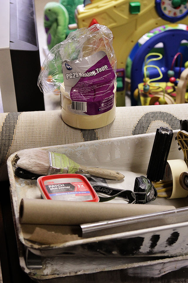
 Working with my friend Jessica McKay of Birdhouse Interiors, I’m updating our man cave of a basement into a modern family-friendly playroom. We’re chronicling the process here and on Jessica’s blog, COOP, and I hope you’ll follow along!
The Backstory
In part one of the basement makeover, I shared my, ahem, distaste for the wall colors chosen by the previous owners: maroon and taupe. In addition to just being ugly colors, they made the room feel dark and heavy. Although the room is a walk-out with a door, full-size window, and two small rectangular windows, it’s still a basement. A dark(ish) basement.
Still, I didn’t want to paint. I thought the job would be too much work for JB and I to do alone (all that woodwork!) and too expensive to hire a painter. Plus, I have a history of being unable to choose paint colors in a timely fashion and didn’t want to have to deal with making a decision.
The Inspiration
Jessica took one look at the basement and quickly nixed my idea to simply cover up the maroon walls with colorful artwork. She reiterated what I’ve read in countless decor magazines: the fastest way to change the look of a room is to paint. Even if we did nothing else to the space, mixing up the wall color would make a huge difference.
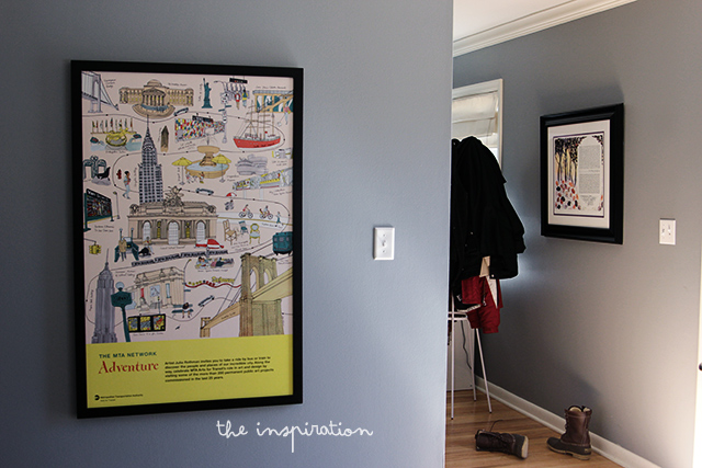
After talking about my vision for the basement — a living space that’s both kid-friendly and grown-up — Jessica walked around my house to get a sense of my aesthetic. Stopping in front of a large MTA poster by Julia Rothman that hangs in our dining room, she asked how I’d feel about using the illustration as our color inspiration. Specifically, how did I feel about teal?
Who was I to argue with the professional? Although the idea of brightly colored walls was slightly out of my comfort zone (no other room in my house features a color as vibrant as teal), I could see how teal would open up the space and give the basement a modern, playful feeling.
Plus, if the color choice was left up to me, we’d still be waiting for my (lack of) decision.
The Plan
Pulling out her Sherwin-Williams fan deck (a designer always carries color swatches in her bag!), Jessica quickly matched two shades of teal in the poster to Tidewater and Lagoon. Jessica convinced me that a teal color scheme would feel gender and age neutral. Basically, girls, boys, kids, and adults could comfortably hang out in there.
She explained that two shades of teal would bring more depth to the room and accent the molding that’s already there, creating more architectural character. Painting the entire space in the darker shade would have felt too heavy in a basement without much natural light.
Jessica strongly recommended that we also paint the woodwork and trim white to match the rest of the house and to brighten up the room even more. I was open to the idea until I received quotes from several painters. All of them wanted to charge an additional $300+ to do the trim, but I decided I’d rather spend that money on new furniture and accessories for the room.
Once Jessica reassured me that the colors we had chosen would still work with the brown chair rail and molding, I booked the painter and ordered our Sherwin-Williams paint. Sherwin-Williams graciously supplied us with paint from their new Emerald line, including tinted primer for the textured wallpaper that the previous owners had painted that awful maroon.
The Results
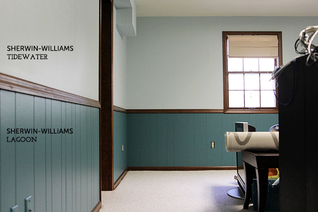
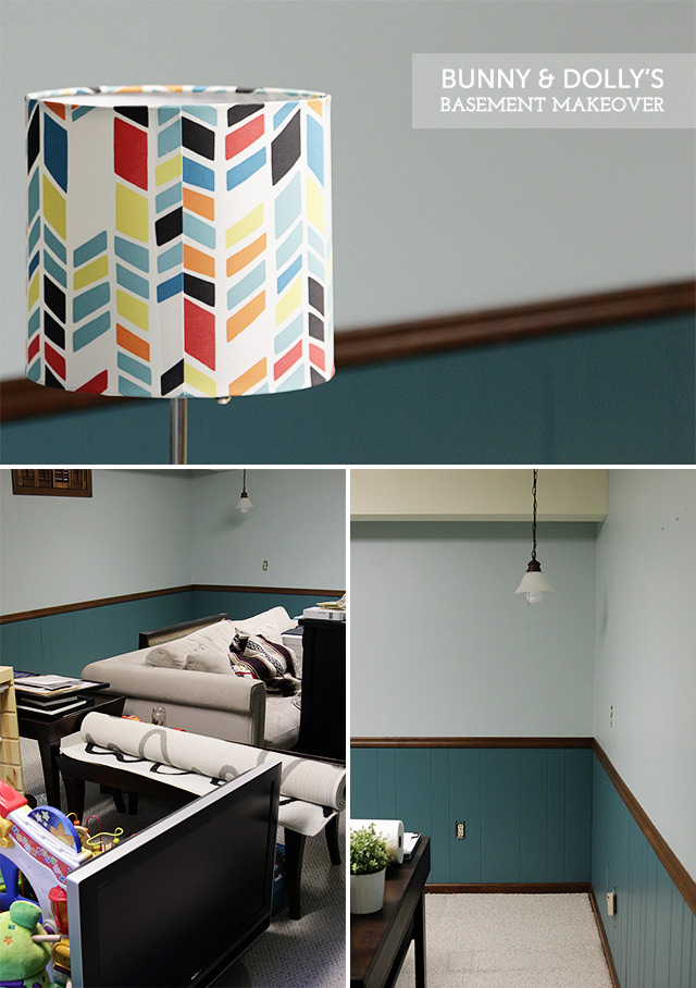
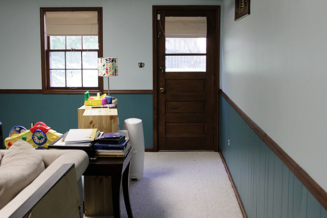
It took just half a Friday and half a Monday for our painter to complete the room, partly because he was efficient and partly because the Emerald paint from Sherwin-Williams did such a good job of covering up the red and taupe wall colors.
The transformation was incredible. Suddenly, the space looked larger and cleaner. Even the painter commented on how much more modern the room appeared minus the dated man cave colors.
Would I have preferred white trim? Yes. Am I unhappy with how it looks now? Not at all. The space would have looked crisp and clean if the woodwork had been painted, but I think the brown trim gives it an earthy, relaxed vibe. What do you think?
Next up: Rearranging and adding furniture!






I painted a set of built-in book shelves in my house recently (they went floor to ceiling). It took a while and a lot of coats and during the project I kept asking myself why I hadn’t just had our professional painters do them too when they painted the rest of the room. However, I finished it. My point being — if you feel ambitious, you could paint your trim at a later date yourself. If I could do it – then you can do it!
Did you have to sand and prime your bookcase? Because that’s the major reason why I don’t want to do it myself — and why all of the estimates we received were so expensive.
I did have to sand them — but just lightly to get some texture. I used a power sander (a tiny one) and it was awesome! I did not prime because I bought the paint with the primer built in.
I had no idea you were DIY-inclined!
PS – the two tone teal looks awesome btw! What color is that gray upstairs? I’m looking for a gray for my guest bathroom once we have some wall paper taken down. (That project gets left to the professionals)
Thank you! The living room and dining walls are Timber Wolf by Benjamin Moore.
I actually prefer the brown over what I envision for the white. I think it makes it a bit unique and definitely earthy.
Love it!
I was SO concerned about leaving the wood trim unpainted, but I’m happy that I like it — and that you do too. Thanks!
I like it!
Thanks!